New projects - CSS feedback button & animate-textshadow

It’s been a while since I blogged last. Since then, lots has happened in the tech world: we had the S3 apocalypse, the PSN debacle, Microsoft bought Skype, the world bought LinkedIn shares. I’ve been keeping myself equally busy, and I’m going to be rolling out a bunch of new coolness over the next few weeks.
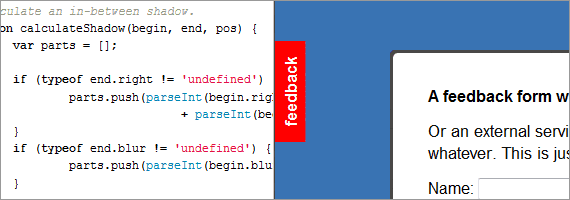
To kick things off, there are two new additions to the Projects section. The first is one of those fancy floating feedback buttons you see everywhere - except this one’s done without images (instead using clever CSS trickery). It’s more of a fun proof-on-concept than something I’d necessarily recommend for production - it’s probably most useful as an example of solid, cross-browser vertical text in CSS (with a bit of supplementary Javascript), which took a while to figure out.
Second, is a redux of Edwin Martin’s excellent Shadow animation plugin providing a way to animate the text-shadow property; you can browse the source on Github. Although I was able to reuse a lot of the code from Edwin’s plugin, but there were a couple of gotchas. Most notably, the spec for text-shadow allows the color to be declared at the beginning or end of the property, while in box-shadow’s spec only the beginning is allowable. Additionally, I wanted to allow text-shadow to be given in em, which meant the text’s font-size had to be passed in to the parser. On the plus side, text-shadow is actually part of the CSS2 spec, so no vendor prefixes!
Loading comments...